Energy Wizard Reporter - Graph
To display this form select : Store Data\Graph
The Store Data Graph is a very flexible graphing tool for specific data over specific
periods of the month.
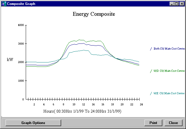
The graph below shows the typical trend for a week day, a week-end day and both week
and week-end days.

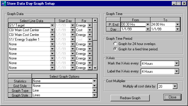
To see other options click on the "Graph Options" button and the following
form will appear.

The above form allows for many graphing options:
Graph Data - Select Line Data
- Select Line Data: In this column select the Cost Centers, Tags, Target or Supplier
Tariffs that you wish to graph. Set all other rows to "None".
- Start Day: This column is only used if "Graph for 24 hour overlays" is
selected. If it is then select the required start day for each row.
- For: In this column select either Energy data or Cost ($) data.
Graph Data - Select Graph Options
- Select the Statistics, Grid Style, Graph Type and Graph Style required.
Graph Time
- Set the start and stop time for the graph.
Graph Time Period
- Graph for 24 hour overlay: Puts the graph into 24 hour overlay mode where day to day
energy consumptions can be compared.
- Graph for fixed time period: Allows to set the graph start and stop time and disables
the graph overlay function.
X-Axis
- Mark the X-Axis every: Set how many marks are to be drawn on the x-axis.
- Label the X-Axis every: Set how many Labels are to be drawn on the x-axis.
Cost Multiplier
- Multiply all cost data by: Set the value by which to multiply the cost data. This is for
comparing costed energy trendes to non costed energy trends.
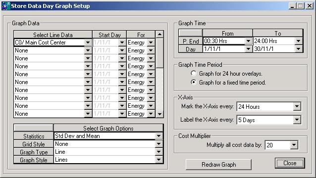
As an example, to get a single graph that plots the trend of the Main Cost Center for
the whole month but with statistics enabled to display the standard deviation and the
mean, try the following setup.

Wizard Help
